How to Design for Letterpress
Letterpress Printing Design Guidelines
Table of Contents
Introduction
Letterpress printing is a beautiful form of graphic reproduction. However, there are specific do's and don'ts to consider when designing for it.
File Formats
- Preferred: Vector files.
- Acceptable: Bitmap files (raster images) from Photoshop, but they should be at least 1200 dpi and converted to bitmap via a 50% threshold.
- Best Practices: Use EPS files with outlined type and press-ready PDFs. For Adobe Illustrator, outline the type and save with a new file name. For Adobe InDesign, package the job to include all linked images and fonts.
Colors
Use only solid uncoated Pantone colors. Avoid process, CMYK, RGB, LAB, Indexed colors, or any other color libraries.
Fonts
Many fonts are suitable for Letterpress, but avoid sizes smaller than 6 pt, extremely thin fonts, and tight letter spacing.
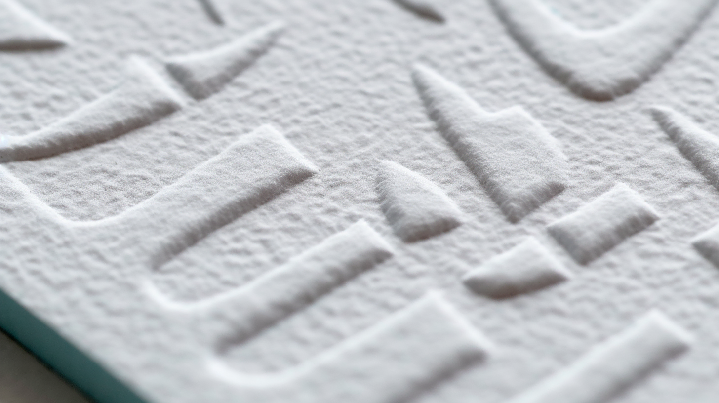
Photos & Screened Images
Photos and screens aren't ideal for Letterpress. For tints of a darker color, consider using a second, lighter colored ink or opt for offset printing.
Line Widths
Recommended minimum line thickness is 0.5 pt, though 0.25 pt can be used with caution.
Inks
Letterpress is best for 1-3 colors, though more can be used. Each color requires a separate pass through the press, increasing costs.
Reverse Type & Knockouts
Reversing type out of a solid color area is possible, but there are limitations. Thin letters or lines might fill in or plug.
Light Inks & Dark Paper
Letterpress inks are mostly translucent, so they don't fully cover the surface. It's best to use darker inks on lighter papers.
Overprinting & Trapping
Overprinting colors in Letterpress can produce unpredictable results. Trapping, or printing two colors adjacent with a tiny overprint, can maintain original colors.